4 Things to Look for When Buying Vintage Maps

Paper Texture and Watermarks
Printing Method and Plate Marks
Hand-Coloring vs. Printed Color
Fold Lines and Margin Integrity
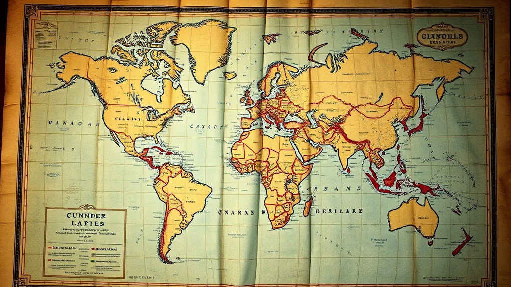
A single sheet of heavy, cream-colored rag paper lies flat on a velvet examination pad. Under a 10x jeweler’s loupe, the surface reveals more than just geography; it reveals a landscape of copperplate engraving, subtle plate marks, and the microscopic topography of hand-colored pigments. For the collector, a vintage map is not merely a decorative piece of cartography, but a forensic document that captures a specific moment in human understanding. This guide outlines the four critical technical indicators—printing method, paper quality, hand-coloring, and provenance—that you must verify to ensure you are investing in an authentic historical artifact rather than a modern reproduction.
The Method of Impression and the Plate Mark
The first step in any cartographic investigation is determining how the image was transferred to the paper. In the era of high-value collecting—roughly the 16th through the 19th centuries—the most significant maps were produced via copperplate engraving or etching. This process leaves a physical signature that a digital printer simply cannot replicate.
When examining a map, look specifically for the plate mark. This is a distinct indentation or "dent" in the paper caused by the metal plate being pressed into the damp fibers under immense pressure. A genuine copperplate map will have a visible rectangular depression surrounding the map's border. If the transition between the map and the margin is perfectly smooth and flat, you are likely looking at a modern lithograph or a digital facsimile.
Beyond the plate mark, use a magnifying glass to inspect the lines themselves. In an authentic engraving, the lines are crisp, sharp, and possess a certain "depth." Because the ink is physically pressed into the paper, the lines often exhibit a slight three-dimensional quality. In contrast, modern offset printing uses a "dot pattern" (the halftone screen) to create color and shading. If you see a uniform grid of tiny dots under magnification, the map is a modern reproduction. A true vintage map will show continuous, unbroken lines of ink that follow the etched grooves of the original metal plate.
Identifying Intaglio vs. Lithography
It is vital to distinguish between intaglio (engraving/etching) and lithography. While many beautiful 19th-century maps are lithographic, they represent a different era of production. Intaglio maps are characterized by the physical "bite" of the plate, whereas lithography relies on the chemical repulsion of oil and water. If you are hunting for high-value 17th-century Dutch cartography, such as works by the Blaeu family, you must demand the physical texture of an engraving. A lack of tactile depth is a primary red flag for a deceptive reprint.
Paper Composition and Watermarks
The "substrate"—the paper itself—is the most reliable witness to a map's age. Before the mid-19th century, paper was not made from wood pulp, which is acidic and prone to rapid decay. Instead, it was "laid paper," manufactured from macerated linen and cotton rags. This distinction is critical for both authenticity and long-term preservation.
To verify the paper, hold the map up to a strong, diffused light source. You are looking for two specific features:
- Laid Lines: You should see a faint pattern of vertical and horizontal lines (chain lines and laid lines) within the paper. This is a result of the wire sieve used during the hand-making process.
- Watermarks: Many high-quality maps feature a watermark—a translucent design embedded within the paper fibers. A watermark acts as a forensic fingerprint, often identifying the specific mill or the year the paper was produced.
If the paper appears perfectly uniform, smooth, and lacks any visible fiber structure or watermarks, it is likely modern machine-made paper. Furthermore, pay attention to the edges. Authentic vintage paper often has "deckle edges" or slight irregularities. If the paper looks too bright or "white," be cautious. Historical paper often undergoes a natural oxidation process, resulting in a warm, creamy, or slightly yellowish tone. However, do not mistake a chemically aged "tea-stained" modern paper for true antiquity; look for the structural evidence of the fibers, not just the color.
Properly maintaining this substrate is essential. Much like storing antique books in an attic can lead to catastrophic degradation, storing maps in high-humidity environments will cause the organic fibers to swell and the ink to bleed. Always treat the paper as a living, breathing entity that reacts to its environment.
The Authenticity of Hand-Coloring
In the history of cartography, color was rarely a printed feature; it was a secondary, artisanal process applied after the printing was complete. This is known as "hand-coloring." While many collectors desire vibrant colors, the method of application is what determines value.
To determine if a map is truly hand-colored, look for the following:
- Color Bleed and Variation: Because pigments were applied by hand using brushes, you should see slight variations in intensity. One ocean might be a slightly deeper blue than another, or a border might have a tiny "overstep" where the color extends a fraction of a millimeter past the engraved line.
- Pigment Texture: Look at the color under magnification. Hand-applied watercolor often has a translucent quality, allowing the texture of the paper and the engraved lines to show through. If the color looks "flat," opaque, or sits perfectly uniform across the entire surface, it is likely a modern color lithograph.
- Oxidation of Pigments: Certain historical pigments, such as verdigris (a green pigment made from copper), are chemically reactive. Over centuries, verdigris can actually "eat" through the paper or turn a brownish hue. If you see a green tint that has slightly darkened or caused a slight brittleness in the paper, this is a strong indicator of authentic, aged pigment.
Be wary of "modern hand-coloring." Some unscrupulous dealers take high-quality black-and-white facsimiles and apply watercolor to them to increase the perceived value. Always check if the color sits on top of the ink or if it interacts with the topography of the engraved lines. In a true vintage map, the color and the engraving are two distinct layers of history working in tandem.
Provenance and Geographic Context
The final pillar of map collecting is the "why" and "where." A map is a snapshot of a specific geopolitical reality. To collect intelligently, you must understand the historical context of the map's creation. For example, a map of the Americas from 1650 will look fundamentally different from one from 1750, as colonial boundaries and discovered coastlines shifted rapidly.
Provenance—the documented history of ownership—can exponentially increase a map's value. A map that was once part of a famous library or a renowned explorer's collection carries a weight of authority. When purchasing, always ask for the "provenance" or any associated documentation. Does the map have marginalia (handwritten notes in the margins)? Does it feature a specific collector's stamp or a bookplate? These markings are not defects; they are the "DNA" of the object's journey through time.
When you are evaluating a piece, treat it with the same scrutiny you would use when identifying a true first edition book. A map with significant marginalia from a known historical figure is often more valuable than a "clean" but anonymous copy. The goal is to find a piece that tells a story—not just the story of the geography it depicts, but the story of its own existence as a physical object.
By mastering these four disciplines—inspecting the plate mark, verifying the paper structure, analyzing the pigment application, and researching the historical context—you move from being a casual buyer to a true collector. You are no longer just buying a picture of the world; you are acquiring a physical witness to how the world was once understood.