
The Single Most Reliable Tell of a True First Edition (And Why Most Collectors Miss It)

Quick Tip
Check the gutter before the copyright page—printing depth, alignment, and paper reveal the truth of a first edition.
Case Study: The specimen before us appears unremarkable at first glance. A mid-century hardcover. Clean boards. Price-clipped jacket (already a small tragedy). The seller swears it’s a first. The listing says “early printing.” The photos—strategically soft—offer nothing of value.
But the truth, as always, is not in the boast. It’s in the gutter.

The Tip (Read This Twice)
Ignore the copyright page first. Go to the gutter.
Most collectors—particularly those raised on digital checklists and dealer shorthand—begin their inspection with the copyright page. They hunt for the words “First Edition,” or the number line, or a Scribner’s “A.” It’s not wrong. It’s just dangerously incomplete.
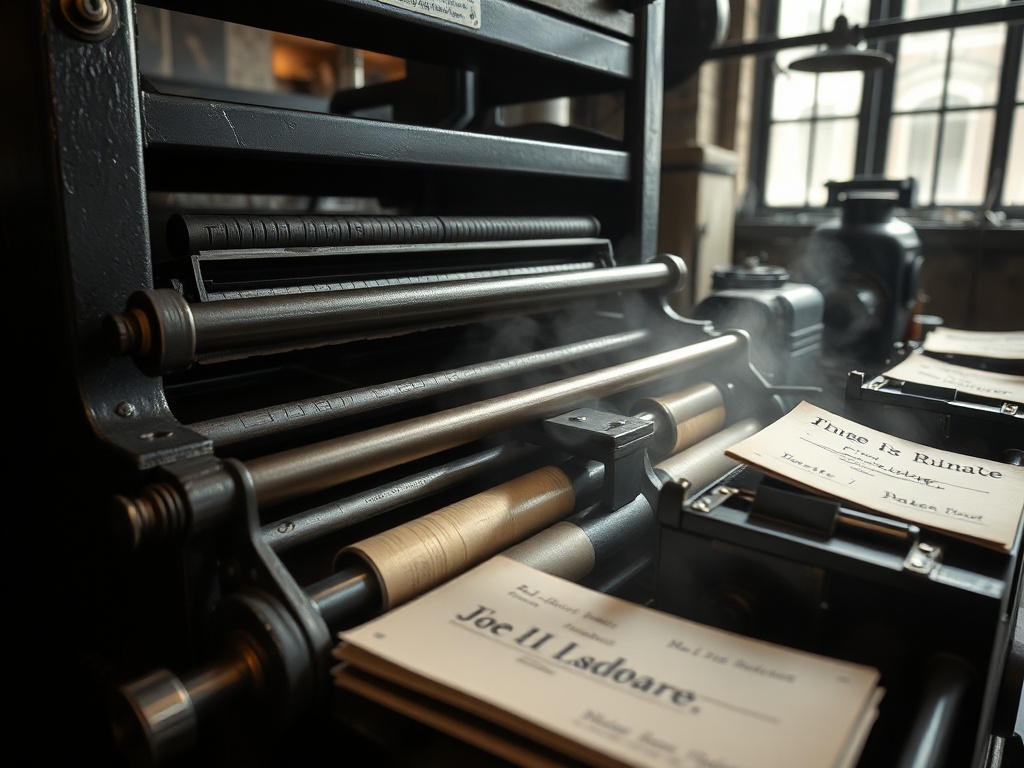
The gutter—the inner margin where the pages meet the spine—is where the book stops lying.
That’s where the printer’s reality lives. That’s where you’ll find the subtle shifts in pressure, the uneven ink distribution, the microscopic tells of early vs. later impressions (referring, of course, to how plates wear down across print runs).
A true first state often reveals itself not through what is printed—but how it is printed.

The Anatomy of the Gutter Tell
Let’s slow this down. You’re holding the book. You’ve opened it roughly halfway. Now tilt it slightly toward a light source—never overhead fluorescence; you want a directional glow, like a desk lamp or late afternoon window.
Now look for three things:
1. Ink Depth Variability
In early printings, the plates are fresh. The ink sits with a slight relief—you can sometimes feel it if you run a clean fingertip across the text block (gently; we’re not animals).
Later impressions flatten. The type loses its authority. Letters become ghosts of themselves.
The gutter exaggerates this. It compresses the page just enough to reveal inconsistencies. A first state will often show uneven richness—a kind of muscularity in the ink.
2. Signature Alignment
Books are printed in folded sections—signatures. In early runs, alignment is rarely perfect. There’s a slight arrogance to it, as if the printer trusted the process more than the precision.
In the gutter, you’ll sometimes see a faint stagger. Not a flaw—evidence. Later printings tend to correct this. They become too neat. Suspiciously neat.
3. Paper Compression and Shadow
Here’s where things get interesting.
Early print runs often use slightly different paper stock—or at least paper that hasn’t yet been “standardized” by cost-saving adjustments. When compressed into the gutter, this paper creates a deeper, softer shadow.
Later printings? Thinner stock. Sharper crease. Less depth.
The difference is subtle. But once you see it, you won’t unsee it.

Why the Copyright Page Lies
The copyright page is a performance.
Publishers reuse plates. They forget to update statements. They intentionally blur printings (particularly in mid-century reissues). And then there are book club editions—those wolves in borrowed jackets—mimicking firsts with just enough conviction to fool the casual eye.
I’ve seen “First Edition” stated plainly in books that are three printings removed from the truth.
The bibliography never lies. But the publisher’s page? Occasionally… she embellishes.
The gutter doesn’t embellish. It doesn’t know how.
The Field Test (What to Do in the Wild)
You’re in a dim estate sale basement. The air smells of cardboard and neglect—acceptable. You’ve got three minutes before someone with a phone scanner muscles in.
Here’s the sequence:
- Open the book to the middle. Not the front. Not the title page. The middle.
- Tilt toward light. Create shadow in the gutter.
- Scan for ink depth. Is it alive or flattened?
- Check alignment. Slight irregularity is your friend.
- Feel the paper (lightly). Is there substance? Or economy?
If the gutter passes the test, then you move to the copyright page to confirm the known points. Never the other way around.

A Note on Exceptions (Because There Are Always Exceptions)
This is not a universal law. Nothing in this trade is.
High-end private press books—particularly those from obsessive printers—can exhibit near-perfect consistency even in first states. Conversely, wartime printings may look crude regardless of edition.
But for the vast majority of 20th-century trade books, the gutter remains one of the most reliable early indicators.
(And yes, there are outliers. There are always outliers. That’s why we don’t trust a single tell—we build a case.)
The Real Reason Collectors Miss This
Because it requires presence.
You can’t outsource this to a checklist. You can’t zoom in on a listing photo and feel paper density. You can’t smell ink age through a screen.
The gutter demands that you slow down. That you handle the object. That you treat the book not as a commodity—but as a witness.
Most collectors don’t miss this because it’s hidden. They miss it because they never look.

Verdict
This is not a trick. It’s a shift in sequence.
The next time you pick up a suspected first, resist the reflex to flip to the copyright page like a tourist checking a map.
Go to the gutter first. Let the book speak in its own physical language.
Because when she’s genuine, she doesn’t need to announce it. The evidence is already there—pressed into the spine, waiting for someone patient enough to notice.
Tip: The gutter tells the truth before the title page has a chance to lie.
Happy hunting.